Drawing Life Into Inanimate Objects

Hi everybody,

I want to talk about adding life to everyday mundane objects. I think the three best things to liven up an ordinary object include:

1) adding in some sort of human element,

2) adding in elements of nature,

Or at the very least,

3) adding movable and bendable parts.

In my opinion, storytelling with an image is more compelling when the items in the image feel like they’ve been tampered or handled by something living. It instantly adds a little more character and interest to the piece.

Just a regular box.

Just a regular box.

If I were to draw a stack of boxes in the background of a scene, it’s important to think about each object as having a life of its own. The box on the left has a few nicks and is slightly off-center, which is fine. But for it to get there, a human or human-like character would’ve had to place it there. There might be tape on the outside. It might be a little squished from being sat on or having a heavy box set on top of it. Also, adding a simple “fragile” symbol and bar code implies it has been or will be handled by a human.

Remember, moderation is key. Just as I wouldn’t draw 20 plain boxes in the background, I wouldn’t draw 20 interesting boxes in the background either. There’s a chance things would get a little too confusing and distract from the main point of the images. After all, these boxes are meant as background props.

20190810_005232.jpg

Often times as an artist, you’ll find yourself drawing the same background images over and over. It’s nice to add a little bit of disparity to them every once in a while. For this brick wall, I darkened some of the colors on the bricks to add some randomness and imperfection to the wall. Humans are imperfect. If they are flawless, they are instantly unrelatable. That’s why it’s hard for me to relate to most people. Just kidding.

Since the wall is exposed to the elements of nature, you can also add moss or grime build up. Moss growth and grime build up has a tendency to be random. You’re allowed full freedom to place them anyway you’d like, but tastefully of course. Gum, bird droppings, spit, and any other signs of tampering can do a great deal as well.

Metallic objects are a little more difficult. They are as cold and emotionless as they come. Adding dents will help, to show it has been handled and has gone through some wear and tear. Rust, like moss, is also a great naturally occurring detail to sprinkle in. The great thing about rust and moss is that you can add a little or a lot and it would be completely fine, depending on what you want. Adding a label or company logo instantly brings it back to life. It shows that it has history and a purpose. It was created for a reason by a group of people and is meant to be used in a certain way.

If all else fails and you’re not able to add rust and labels and the like, adding movable and bendable parts may help. For the oxygen tank, I’ve added in little tubes to break away from the form. Also, other human elements like nuts and bolts, pressure gauges or free flowing things like smoke and dripping water can do a great job to add life to metal objects.

Of course, if you want your image to be lifeless and serious, you would need to go in the opposite direction and keep it as clean as possible. It’s all about what kind of story you want to tell.

That’s it for now. Thanks for reading!

My Process of Making Comics: Details From Script to Finalized Version

Hello Everybody!

It has been quite a while, hasn’t it? As you may know, I have been working on quite a few little projects here and there and I’ve been getting a lot of questions about my work process, so I thought, why not start this blogging thing again to explain how I take a written script from start to finish.

Here’s a page from a little project I illustrated called The Soul Man, by Jared Brunk.

The Soul Man, page 1, by Jared Brunk and Kennedy Nguyen.

The Soul Man, page 1, by Jared Brunk and Kennedy Nguyen.

This one is about a man with mystical crime solving capabilities. He lost his daughter years ago and is on a mission to rid the city of evil. Or so it goes. For this one, Jared focused on some key things and was very articulate in what he wanted to be shown. For example, in panel 1, he wanted a bird’s-eye-view of the backyard scene with the shadows of the trees reaching for our two characters, like two hands of the shadows reaching for our protagonist. For panel 2, he wanted “…the many colors of the setting sun” to be visible in the sky.

The Soul Man Pg 1 panel 2a script.png

When you’re writing a story, things that may seem irrelevant, like a car’s make and model or what kind of jewelry a person wears, sometimes go a long way in adding to the personalities of a character. You can say a lot with lone panel of them driving in their vehicle. If, let’s say, our character hops into a big 4x4 pick-up truck or a 7-seater van, his personality would read differently. Even if it's something seemingly subtle like the color of his car. A red corvette is young and flashy. A dark purple corvette is more mysterious.

I mentioned to Jared that with a small panel and a bird’s eye view, it seemed a little crowd to include all of these details in the first panel. He agreed, and so I omitted the bbq grill, seated table, and swing set.

I mentioned to Jared that with a small panel and a bird’s eye view, it seemed a little crowd to include all of these details in the first panel. He agreed, and so I omitted the bbq grill, seated table, and swing set.

My first preliminary sketch of the first page of The Soul Man.

My first preliminary sketch of the first page of The Soul Man.

This is a preliminary sketch of the page that I sent to Jared. Initially, I drew the car coming towards the camera in panel three, but he wanted to change it to a side view of the car so that we could see the blue and red police lights bouncing off of background buildings easier. It’s always great to have a writer to think about details like this so I can focus on the illustration alone.

This is the edited version of the first page of The Soul Man, which will end up being the layout for the final version of the first page.

This is the edited version of the first page of The Soul Man, which will end up being the layout for the final version of the first page.

This is the scanned inked version of the first page of The Soul Man. Yes, I do like blackening out shadows, and yes, it was definitely fun.

This is the scanned inked version of the first page of The Soul Man. Yes, I do like blackening out shadows, and yes, it was definitely fun.

This next image is the third page from the same story. Using his mystical abilities, our lead character benignly possesses the kidnapped girl Susie, and he has quite a bit of a surprise for her captor.

Page 3 Color resized 50.png
The Soul Man Pg 3 panel 4 script.png

As you can see, the words “STAB” written in a splotchy blood red was not noted in the script. Even though I think it added color and emphasize to the dark and murky colors of the basement, I was worried Jared wouldn’t like it so much. So I did a version with and without it just in case. Thankfully, he loved it as much as I did.

While I was doing a rough sketch for the scenes on this page, I needed a bit more info on the layout of the basement. So I sent in a few sample pictures to Jared for his opinion:

This is for the second page, where the Susie is chained to a pillar. I noted the camera view.

This is for the second page, where the Susie is chained to a pillar. I noted the camera view.

This is a mini sketch for panel two of the third page, where the Susie is behind a pillar.

This is a mini sketch for panel two of the third page, where the Susie is behind a pillar.

20181228_010749.jpg

I also had a question about the stairs heading down into the basement. He had a different picture in mind:

He sent me a picture of a perfectly creepy and story-ridden set of stairs, which helped guide the design of the stairs you see in the last panel.

He sent me a picture of a perfectly creepy and story-ridden set of stairs, which helped guide the design of the stairs you see in the last panel.

The Soul Man, Page 3 inked.

The Soul Man, Page 3 inked.

And Voila! After some back-and-forth to fix little details, this is the inked version of the page! After this, I scan in the images and upload them to photoshop, where I finish the coloring using a selection of digital brushes. Jared was descriptive in his writing. And contrary to how it sounds, being more descriptive, as long as I get some input, actually allows me to be more creative freedom. It gives me more to work with and helps get my brain juices flowing.

This next one is written by F.E. Rahman. It’s a single page about a monster dad and his monster son, called Marriage.

Marriage by F.E. Rahman and Kennedy Nguyen

Marriage by F.E. Rahman and Kennedy Nguyen

I used more muted earth tones and a simple layout in this one. Rahman did include things in the script that weren’t meant to be seen by a reader, which I thought was interesting, but it definitely helped me fine tune the faces of the father and son monsters.

Marriage Script by F.E. Rahman

Marriage Script by F.E. Rahman

I especially liked the description “Khydo looks up at Buzurg exasperated. Isn’t it obvious?” Why yes, I guess if you put it that way, it is obvious. I kept the inks to a minimum and did this rest of the textures in Photoshop.

Marriage Inks.

Marriage Inks.

This last one is the first page of a NEW horror comic I am working on with Chris Garrett, called Dark Pines. It’s about a man by the name of Paul Shire who witnessed the death of his younger brother at an early age. He doesn’t remember much of the details, but he is older now and memories of his past are starting to flow back to him. With all the strange things that are happening around him, Paul believes the person or thing that killed his brother is back in town.

Dark Pines page 1, by Chris Garrett and Kennedy Nguyen.

Dark Pines page 1, by Chris Garrett and Kennedy Nguyen.

Dark Pines, page 1 inked.

Dark Pines, page 1 inked.

As you can see, I left much of the background blank knowing that the details will be finished in Photoshop. The clouds in the night sky, the splotches of blood, and the textures on the faces were done with a digital “crayon” in Photoshop.

Pigma Micron 02 versus Pentel Pocket Brush Pen.

Pigma Micron 02 versus Pentel Pocket Brush Pen.

You may have noticed the style is a little different between some of these pages. In The Soul Man, I opted to for the Pigma Micron pen, which delivers a scratchy mark from a fine point. It allows for a more deliberate approach. No matter what you do with your hand, the lines comes out the same. For Dark Pines and Marriage, I decided to switch to a Pentel Pocket Brush Pen.

20190714_090810.jpg

The interesting thing about this brush “pen” is that it uses actual bristles, not just a felt tip. This allows for a more expressive approach when inking.

20190714_091040.jpg

These are all down with the same pen. I can get thin that resemble a pen and thick lines that resemble a sharpie. I can also get a tapering hair thin line. And most of all, I can get lines that mimic both a wet and dry paint brush. That’s why the Pentel Brush Pen quickly became my favorite pen and has been my inking pen for many years. The only downside is that it does require a steady hand to use. The slightest change in hand pressure results in a change in line width.

I hope you enjoyed this post! Dark Pines is still in the works, but stay tuned. It will be out sometime in the future! Thanks for reading!

My 2018 Successes and Failures (And Why Announcing Your Goals May Not Be Such A Great Idea)

Greetings folks! What a year 2018 has been!

Ok, let’s get down to business. In this blog, I want to discuss my successes and failures of 2018, my plans for 2019, and finally, why announcing your goals may not be as beneficial as you might think. Of course, there are counterarguments to be made for both sides, so let’s dive in.

2018, oh how you were this romantic idea of success in my head. We’ve been through a great deal, you and I. And although we had our moments, I still think we grew and accomplished a lot together. So, here’s my list of art-related goals from the beginning of 2018 and how I fared with them:

  • Finish a full comic book novel and make copies: Well, it has come to this, hasn’t it? Let’s get this part out of the way: No, I failed to finish and print a comic book. So in an attempt to learn from this, I’m taking this opportunity to understand why that is. Firstly, this is a daunting task in and of itself. Writing the script for my story took me a few weeks to flush out, and completing a single page took me around 8-10 man hours. Now adding Photoshop color to the mix, it ended up being 14-16 hours per page. I was planning to knock out a comic book that was at least 50 pages, in full color, even though I’ve never done anything remotely on this scale before. You can see where the hours go. It’s a full time commitment, and to be so vain enough to think I could accomplish such a task in a year along with other goals that I’ve set, while maintaining a separate full time job, I was getting in over my head. And it was apparent. So for this year, I will humbly tackle these comic projects to the best of my ability, taking in daily inspiration, without time as my critic.

  • Have over 300 followers on Instagram: I started 2018 with 184 followers and ended the year with 335. I made 102 Instagram posts in the year of 2018, shared 10 time lapse videos, finished 31 inked drawings in October for my Inktober challenge (I think I gain somewhere from 30-40 followers that month just from doing the challenge), and posted 25 pages of a small side-project comic I’ve been working on. I think gaining a followership on social media is important for building business, cultivating inspiration, and sharing ideas.

  • Finish over 50 Original art pieces: I should’ve been a little more specific about this one when I first announced it. I’m not sure if I meant 50 drawings total, or something else. But regardless, between my posts on Instagram and art commissions, I finished well over 50 Original art pieces.

  • Reopen Etsy and sell at least 20 pieces: I opened it for a bit, then closed it back up. Here’s why. For the most part, there’s two kinds of paper art that artists sell: 1) prints, and 2) originals. Many times, an artist will spend dozens of hours on an original piece, scan it and make professional printed copies of it at $2-4 a print, and the turn it around and sell each print for $15-25. So after a few print transactions, they get their money’s worth on the time they spent on the original. Then they’ll sell the one and only original copy for something like $200 if it’s a drawing, or $2000 if it’s a painting. Well, I tried to do the least expensive version, where I made plenty of original drawings, and sold them somewhere between the price of a print ($20) and an original ($200). This ended up failing because since I was selling them at such a reduced price, I didn’t feel the need to spend as much time on it, and so, it definitely showed on the final version. So I didn’t get many purchases. So for this next year, I plan on considering going the professional print route, and hopefully I’ll learn a few things along the way.

  • Attend 2 comic conventions and network with other artists: I didn’t attend two conventions, just one: Dragon Con in Atlanta. I spent 8 or so hours in artist alley talking to maybe 20 artists about their career and how they ended up where they are now. Many of these guys and girls were working artists, making most of their income on selling art alone. And so it was a huge inspiration to me to work hard in hopes that I will be doing the same one day.

  • Bonus: Begin Children’s book illustrations to keep on the back burner for 2019: I’ve posted a little bit about this on Instagram, but essentially, I’ve been learning Photoshop and studying different children’s book illustration styles so that I understand the market a little more clearly. I tend to get overzealous when learning new things, so hopefully I ride this rush of adrenaline as long as I can.

Throughout all of last year, I was very transparent with my goals and with the things I had been working on. And although I pride myself on sharing the failures along with the successes, I wonder how much of my failure was attributed to me publicly announcing my goals to the world. You see, for a long time, I was under the notion that sharing your goals meant that you now have a certain level of accountability, since you are now under the watchful eyes of your friends and fans. It did give me a sense of urgency, especially since I’m not doing a task only for me but for those who are watching, too. And trust me, many times it has helped me push through the slumps. But after it’s all said and done, I think sharing my intentions so openly was actually to my detriment. Let me explain.

A research done at NYU, led by Peter Gollwitzer, shows us that sharing all of our goals tricks our brain into thinking we’ve accomplished something. You’re getting the joy from the initial announcement, not from completing the goal itself. In his study, students who shared their goals with their instructors were less likely to go through with them than students who had written down their goals in private. The students who had written their goals in private still had a lot more to prove, and thus had to work harder to obtain the feeling of accomplishment.

So, with that being said, I will now announce my new, super simple goals for the year of 2019:

20190108_005111.jpg
  1. Make more money with my art

  2. Reach 1,000 followers on Instagram by end of 2019

I have at least half a dozen ways of making more money this year with my art. I’m going to run down the list and hit them all one step at a time. And then by the end of 2019, we’ll do an official recap of where my successes and failures were.

Secondly, gaining more followers is always a plus. It leads to broader range of networking, additional clients, and more opportunities for higher sales. I’m currently sitting at around 335 followers at the start of January. I do have a few plans that I think will help me get there. And near the end of the year, if some of these techniques ended up working out, I will share how I did it so that you can benefit from a large following as well. Stay tuned!

Whatever hopes and dreams you have floating around in your head and heart, set your mind right and get after those dreams.

Cheers to a great 2019! Thanks for reading!

Children's Book Illustrations and Why I Think They're Awesome

Hi all!

The year is wrapping up pretty quickly. I hope we’re all staying healthy and keeping up with our tasks!

I initially wanted to go back and discuss how Inktober went and a few other things related to storytelling, but now that I’ve been working on that post, I realized that I’m essentially repeating/rewording things I’ve already said. And so, I’d like to talk about a different subject today: Why I’m a big fan of children’s book illustrators and their ability to tell a complete story in a single image.

Many of you already know about my fondness for comics. I’ve also mentioned that I’d like to work for other illustration agencies in the future. But when I mention that I also plan on working on children’s books, I’ll sometimes get a perplexed look. As you can tell, some of my art isn’t exactly suitable for a children’s book style, but I think to be a successful illustrator, you need a well-rounded understanding of several different styles of illustrations. So essentially, this is a blog post about what it takes to become a children’s book illustrator coming from a guy who has never illustrated a children’s book. I hope I’m not overstepping my boundaries in this one, but I think in my pursuit to cover this topic, I will, in turn, learn some things and hopefully teach those who are interested in a career in children’s book illustrations as well.

When I say children’s book illustrations, there’s primarily two categories that successful children’s books fall into: Award-winning trade children’s books and “commercialized” children’s books. Both have the potential to make you lots of money and can pave the road to a successful lifestyle. But the key difference is that trade children’s books have more merit in the industry and require a different understanding of composition, color theory, mood, light and shadow, emphasis, balance, gesture, and overall storytelling through imagery. (Note: I’ve gathered this information over the years from classes, books, and illustrators I’ve come to like, but the things I say in here are still just an opinion, so take it all with a grain of salt.)

Compare these first four images of commercialized success with the second group of images from trade children’s book illustrators:

Don’t get me wrong. I have very fond memories of these books from when I was younger. I used to believe there was a “Clifford” somewhere out there in the world, and any time I came across a patch of reddish fur, it solidified my theory. But in my ai…

Don’t get me wrong. I have very fond memories of these books from when I was younger. I used to believe there was a “Clifford” somewhere out there in the world, and any time I came across a patch of reddish fur, it solidified my theory. But in my aims to achieve award-winning success, I knew that my tastes had to change.

And so I studied the artists that were doing what I wanted to do and what set them apart from all the others. (Top, left to right: Jim Madsen, Nathalie Ragondet. Bottom, left to right: Mary GrandPre, Oliver Jeffers).

And so I studied the artists that were doing what I wanted to do and what set them apart from all the others. (Top, left to right: Jim Madsen, Nathalie Ragondet. Bottom, left to right: Mary GrandPre, Oliver Jeffers).

Let’s deconstruct a few of these to understand what makes the second group so much more appealing.

Composition: This is probably one of the most important stages of illustration. If your composition isn’t careful thought out, then no matter how much time you spend on detailing the image, it will fundamentally be flawed. The main things to focus on in this stage are larger shapes and silhouettes as well as empty, less-exciting space to balance out the image. Let’s take a look at each of these illustrations by Jim Madsen and how he composed them so that they are visually clear and concise.

Jim Madsen is careful to keep the subject matter in his artwork balanced. He emphasizes their shapes by painting the background light and simple. If the composition seems to favor one side, he will balance out the other side with smaller shapes, lik…

Jim Madsen is careful to keep the subject matter in his artwork balanced. He emphasizes their shapes by painting the background light and simple. If the composition seems to favor one side, he will balance out the other side with smaller shapes, like he has done in the second example.

Color Theory: After the composition stage, illustrators will then do a color pass where they experiment with different color swatches to get the feeling just right. This is sometimes done quickly in Photoshop or done in a smaller scale if drawn traditionally. As you can tell with the images below, each illustration has the same composition but tells a completely different story.

Taken from an illustrator online by the name of Xu Zhang. As an illustrator, you select the colors that best tell the story you want to tell. It can be as ominous as the one on the top left or as romantic as the one on the top right. The one on the …

Taken from an illustrator online by the name of Xu Zhang. As an illustrator, you select the colors that best tell the story you want to tell. It can be as ominous as the one on the top left or as romantic as the one on the top right. The one on the bottom right is my favorite. It tells a story of anguish and disparity in a hopeless wasteland, perfect conditions for a hero to be born. Storytelling through color alone, who would’ve guessed.

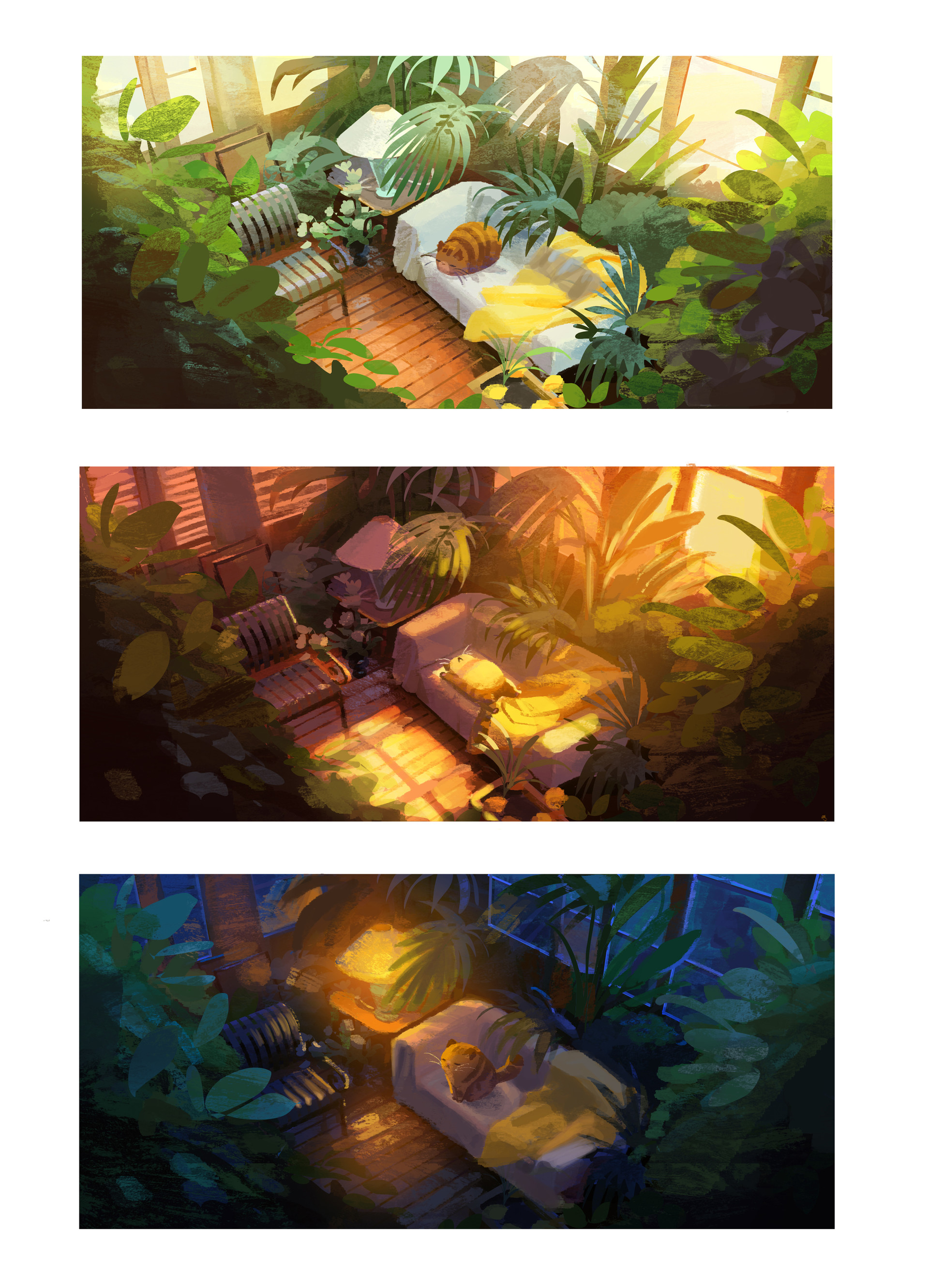
Light and Shadow/Emphasis: Things that are well-lit tend to pop out more because it attracts more attention. Things that are in shadow tend to hide better. This seems fairly obvious, but sometimes I find myself forgetting this. Some artists will vary the light source throughout their painting to guide the eye to the places they want the viewer to see first. On the contrary, it’s also possible to have way too many light sources, in which case, each light source will be grabbing for your attention, and the image may end up looking scattered and unfocused.

This is a room lighting color study by Julia Blattman, a Disney Concept Artist. As you can see, the third picture, when compared to the first, has a clear focal point coming from the lamp’s light source. She also uses the floor’s hard surface and ch…

This is a room lighting color study by Julia Blattman, a Disney Concept Artist. As you can see, the third picture, when compared to the first, has a clear focal point coming from the lamp’s light source. She also uses the floor’s hard surface and chair to bounce back some light, keeping it tasteful.

Gesture: Ah, the subtleties of gesture. Gesture can come from the human form, hands, hair, and clothing, just to name a few. It can also come from more subtle things like fabric, animal fur, loose leaf paper, water in a glass pitcher, smoke, fire, spaghetti noodles, or anything else that is shape-able and free-flowing. Once the entire image is planned out, adding in little gestures like this can turn the art work from great piece to a living one. And of course, in contrast, anything solid, rigid, and monotonous will show itself as lifeless, which isn’t necessarily a bad thing. Sometimes you do want lifeless in your art to evoke a certain kind of mood.

This is a painting done by John Loren. I’ve highlighted the gestures and subtleties on the image on the right. He plays with the smoke coming from the pot, the sag in the boy’s hat, the bend in the stack of books on the chair, the clumpy droop of so…

This is a painting done by John Loren. I’ve highlighted the gestures and subtleties on the image on the right. He plays with the smoke coming from the pot, the sag in the boy’s hat, the bend in the stack of books on the chair, the clumpy droop of soup coming from the spoon, the folds in the table cloth, the dead flower, and even the man’s mustache. Had the soup been a clean straight drip, or the flower been perfectly alive sitting in the vase, the painting wouldn’t have given off the same vibe. It sometimes takes a second or third look to see all the little things he’s added in there, but in my opinion, it really sells the painting.

There’s much more that goes into illustration for children’s books than meets the eye. I am fairly certain pursuing the art of creating art will take many lifetimes to learn, and learning the little and big intricacies that make something great has always been a fascination of mine.

I hope you enjoyed this post and thanks for reading! Have a great New Years!

The Art of Storytelling

Hello everyone! Wow, Thanksgiving is right around the corner! I hope we're all keeping warm and healthy!

For this blog, I wanted to share why I’m so fascinated with storytellling and why I think some stories hit closer to home than others. I love them all: real ones I've experienced, ones I've heard from others, some I've made up, and some that were passed down onto me. And like many things, I believe there's an art form to all of this. If done in just the right way, it can alter your perspective of the world. It never ceases to amaze me that fictional characters, ones that I didn’t know of a few hours prior, can seem so real. Well, it’s because these characters are thought up by actual humans with actual emotions. No one can understand us better than ourselves. And I think the best storytellers are the ones who’ve taken it upon themselves to venture out and explore the universe and experience the wide range of happiness and hurt that all of existence has to offer. Then when they are weary from their travels and are ready to park their space vessel, their stories will have already been etched onto the paint of their ship.

Outcast is a comic book series created by writer Robert Kirkman and artist Paul Azaceta. It is a supernatural horror story about a man whose loved ones have been involved in demonic possession since his childhood. Yes, it was raining, and yes, I got…

Outcast is a comic book series created by writer Robert Kirkman and artist Paul Azaceta. It is a supernatural horror story about a man whose loved ones have been involved in demonic possession since his childhood. Yes, it was raining, and yes, I got wet. It was fitting.

Let me share a quick story. This took place maybe three or four years ago, a few months after I had decided I wanted to be an illustrator for a living. I had just gotten home from a busy shift at work. The house was quiet and it was late, around 1 am. I had a comic novel on the side of my bed that I’ve been meaning to get to. It was a book called Outcast by writer Robert Kirkman (creator of The Walking Dead) and artist Paul Azaceta. It felt like the right time to start reading it. Kirkman’s flow along with artist Azaceta’s perfect facial expressions were enough to move me. I sat there for a full two hours going through a comic that should’ve taken me 30 minutes to read. The conversations felt real. The stress, headaches, bitterness, and sadness all felt like they belonged to real people. I got to a particular part in the book and had tears rolling down my face.

Maybe it was late. Maybe I was reminded of something in the past. And although I know this happens all the time to people, it wasn’t until this moment when I realized how much of an impact these two people can have on me and the rest of the world. I’ve never met either of them. I don’t know what they're currently up to. I don’t even know how to pronounce Paul Azaceta’s last name. And yet I was touched in such a powerful way, and it impacted my life without them even knowing it. How many hundreds of thousands of others did they move years after they’ve finished printing the book? All good stories develop your character and understanding of the world. That’s why I believe good storytelling is so powerful.

I think humans are innately natural storytellers, passing down stories since prehistoric times. For thousands of years before the written language, cave paintings were an integral part of human culture. They were used to transmit information, docume…

I think humans are innately natural storytellers, passing down stories since prehistoric times. For thousands of years before the written language, cave paintings were an integral part of human culture. They were used to transmit information, document personal experiences, and practice religious beliefs. This is me trying to sound like a textbook.

Now I’d like to talk about the two things I think makes a great story. I’ll also share a couple of stories in the written and visual medium.

The Two Things I Think Every Story Needs

  1. Purpose

  2. The Human Element

My favorite kinds of stories are those that motivate and inspire. The ones that call you to action. If they are entertaining, that’s a huge plus. If the visuals and sounds are outstanding, that’s another huge plus. But if all the bells and whistles are taken away and there is no purpose, then all we have is a one-dimensional story with special effects.

As you’re watching your next film or TV series, ask yourself: Why am I so drawn to this? Think about the feeling of triumph, or weakness, or vulnerability. You may not notice it but your heart might also be racing. Some action movies I see today have one purpose and one purpose only: to entertain. And although for some it may pass, in my opinion I think it lacks the key elements of good storytelling. A compelling movie can entertain, but also inspire, teach, and move you. If you know me, you know I love Pixar, not only for their amazing artistry and innovation but for their beautiful, heart-tugging stories. In fact, their creative team follows 22 rules that each of their movies must follow, with one of my favorite being: “You admire a character for trying more than for their successes.” Writing moving stories, organizing a creative team, animating the script, compiling key voice actors, and meeting deadlines is hard enough, but to adhere to 22 rules on top of all that? I think it speaks volumes in what kind of work they want to produce.

If you haven’t seen the latest short Bao (2018), I highly recommend it. Everything from the music to the expressions to the art style is perfect. I think as we get older, we get so busy and life gets so hectic, we tend to forget the human element in life and the things that are truly important to us. It took a few minutes of watching this short to remind me of one of the most important things things in my life, and that’s family.

Bao (2018) by Pixar Animation Studios. A story about a tasty treat and how it isn’t until later in life that we realize how tasty we really are. I’m joking. It not about that. But it is amazing nonetheless.

Bao (2018) by Pixar Animation Studios. A story about a tasty treat and how it isn’t until later in life that we realize how tasty we really are. I’m joking. It not about that. But it is amazing nonetheless.

A couple years ago, I played a game called Undertale. In this game, I controlled a child who had fallen underground in a dark and supposedly evil-ridden world. And in this game, I saw him grow based on his decisions. He made fictional friends and fought fictional foes in this fictional world, and yet he felt real. By the time I had reached the end, I realized all my actions in the game had consequences. Every good deed I’ve done in the game was dirtied by every bad deed I’ve done. I realized the character I was playing had become a mirror image of me.

That’s a perfect example of the human element. Years after completing the game, I still think about these fictional characters and what I’ve done to them. Why was I so mean to this particular person. Could things have been different? It may seem silly but it allowed me to physically see how I treat real people on a day-to-day basis. Undertale beautifully encapsulates the bonds between family and friends and integrated me into the fictional world, which I, in turn, made real. This fictional game showed me how human I really am.

We all know story telling can be done in films and novels, but powerful story telling can be done through songs as well. “Cigarettes and Saints” by The Wonder Years is a great example of that. Lead singer Dan Campbell wrote this song about a heartbroken man struggling with depression, and his hatred towards pharmaceutical companies and drug addiction. When I found out the song was about one of his friends who overdoses and passes away while Dan was on tour, I felt the pain he was trying to release through his song. I imagined the helplessness of having to put on a show with a smile on your for an eager audience, all while knowing that you weren’t there for a friend when he needed you the most. Give it a listen:

Lyrics: “Twice a week I pass by the church that held your funeral and pastor’s words coming pouring down like rain. How he called you a sinner but said now you walk with jesus, so the drugs that took your life aren’t gonna cause you any pain. I don’t think he even knew your name. I refused to kneel or pray. I won’t remember you that way but I lit you a candle in every cathedral across Europe. I hope you know you’re still my patron saint. I tried to forgive but I can’t forget the cigar in his fist. I know that they were heartsick but I need someone to blame and I know how they blame me. I know what you’d say. You’d tell me it was your fault. I should put all my arrows away. I’m sure there ain’t a heaven, but that don’t mean I don’t like to picture you there. I bet you’re bumming cigarettes off saints. I’m sure you’re still singing but I’ll bet that you’re still just a bit out of key. With that crooked smile pushing words across your teeth. You were heat lightning. You were a storm that never rolled in. You were the northern lights in a southern town, a caustic fleeting thing. I’ll bury your memories in the garden; I’ll watch them grow with the flowers in the spring. I’ll keep you with me.”

“These wolves in their suits and ties saying ‘kid you can trust me.’ Charming southern drawl, sunken eyes. Buying good will in hotel lobbies. They got fistfuls of pills to make sure you don’t hurt no more. You don’t gotta feel anything. Got their fangs in our veins. Got their voice in our heads. Got our arms in their grips. No, we can’t shake free. This god damn machine; hungry and heartless. My whole generation got lost in the margin. We put our faith in you. You turned a profit. Now we’re drowning here under your waves. Drowning held under your waves. Drowning here. Drowning here. You can’t have my friends. You can’t have my brothers. You can’t have my friends. You can’t have my brothers. You can’t have my friends. You can’t have my brothers. You can’t have me. No, you can’t have me.”

Lastly, I want to share with you a short story that I stumbled upon years ago:

“For sale: baby shoes, never worn.”

That’s the entirety of it. Six simple words, and yet the storytelling is all there. There isn’t much to say about this other than the fact that you don’t need much to illicit a strong emotional response. I love this idea of keeping things short and sweet, and I try to transfer that to the stories on my Instagram posts. Because the nature of the medium and the millions of pictures posted by other users everyday, it’s so easy to scroll past a post never to come across it ever again. That means in every post, I must put my best efforts in trying to capture my audience’s attention, even if it’s for another few seconds. And once I have their attention, I must keep them entertained throughout my post or they’ll move on to the next post. Yes, it’s like trying to entertain a hyperactive hamster on caffeine, but it has taught me a lot in keeping things short and simple and stripping away the excess to reveal the most important details.

In each of our Instagram pages, we tell our own stories, whether be about our life, or our new restaurant, or our new business. We each have something we want to share with the world. And on my page, I want to share a story I’ve been working on for a long time now, the story where a twenty-something-year-old who quit college accomplishes his dreams of being a full-time illustrator. I want to share the ups and downs, the slumps, the inspiration and lack of motivation. I want to inspire other young and old people that through hard work, dedication, and constantly believing in yourself, you can really make a living doing what makes you the happiest. I want to show my audience that it can be done, with proper networking, learning, studying, with or without school, so that when I’m old and frail, I will have written the greatest story I can ever write: The story of success from a man who never gave up.

And that’s it for this post! I will talk about Inktober on a later date, after I’ve done a little more research. I hope you got a little something out of this post! Thanks for reading and sticking to the end!

Dragon Con September 2018

Hello everyone!

Hope you’re all doing well! I’ve been meaning to make a post about this for the last few weeks. I wanted to share my Dragon Con experience and hopefully you’ll read something that might resonate with you in some way.

But without further ado, all I can say is, WOW, I should’ve definitely gotten a multi-day pass. I’m a little ashamed to say this, but before this event, I’ve actually never attended any kind of convention. I had a goal set at the beginning of the year to make it to some of the big ones like San Diego Comic Con, but before I knew it, half the year had gone by, and I had placed it on the wayside. I started to think it wasn’t going to happen this year since the workload and deadlines I’ve given myself started catching up to me. I thought, “There’s always next year. These Conventions aren’t going away any time soon.” This kind of thinking is exactly why I have a such a hard time going through and committing to things, whether it be starting a new healthy habit or maybe taking a leap in a positive direction in regards to my career.

A couple months ago, I was talking to a coworker about my recent plans on networking and how I plan on creating a website to help facilitate my mission, and he responded with “Dragon Con is coming up in a few weeks. Why don’t you do that?” That was absolutely the best thing he could’ve said to me in that very moment. What better way to network than to talk face-to-face to some of the professionals already working in the field.

I purchased my one-day pass, requested off work, I told myself I was going to stay in artist alley from morning to night, making as many connections and humbly asking for as many tips as I possibly could. And that’s exactly what I did.

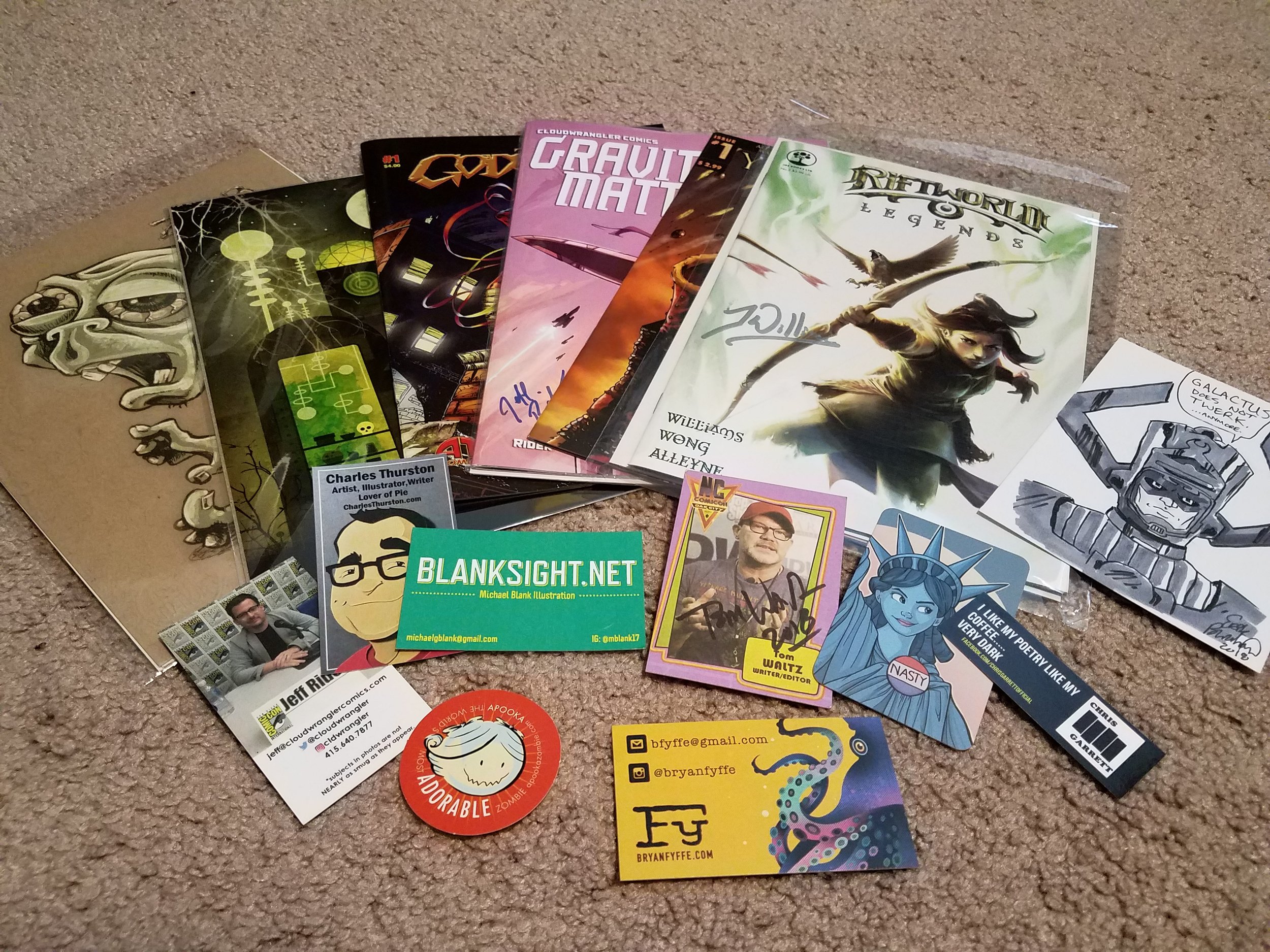
These are some of the books and artwork I picked up from the Con. As you can see, I was also scouring for business cards.

These are some of the books and artwork I picked up from the Con. As you can see, I was also scouring for business cards.

I think I might’ve had full in depth conversations with a total of 20 or so artists, some more progressed in their career than others. But I kept hearing similar advice over and over. One being that if I want to come off as a professional artist to clients, I need to have professional work and an easy way for them to access it. I buckled down and did some research on what I liked in others’ portfolio websites, and sticking with a clear and simple design, I created this very website that you are on now.

Another good advice I received was to start small and finish what you say you are going to do. Nobody likes a person who makes empty promises. If anything, he just looks foolish. I tend to be overly ambitious, and it tends to get me in trouble. So I’ve been trying to stick with this advice. Start small and finish it.

In addition to these wonderful tips, I also had a few editors and writers ask me to send them my work. While some of these fell through, one gentlemen decided to put some faith in me, and we’re currently in the beginning stages of working through a mini series. I have a lot of confidence in working with this man. He is filled to the brim with knowledge, and it has left me thinking there’s so much more I need to learn if I want to be successful doing this. Hard work and patience is key here. I’m very excited to have been given such an opportunity, and I hope that I can share some of our progress in the near future. Stay tuned!

That’s it for my very first blog post ever. I hope you got something useful out of it. Until next time, happy working and destroy your tasks this week!

These are my notable mentions I picked up from the Con. I finished We Can Never Go Home a week ago in one sitting. It’s been two weeks, and I’m still thinking about that book. It is funny and engaging, but also very grim. It’s one of those books whe…

These are my notable mentions I picked up from the Con. I finished We Can Never Go Home a week ago in one sitting. It’s been two weeks, and I’m still thinking about that book. It is funny and engaging, but also very grim. It’s one of those books where the characters stay with you long after you put the book down. I definitely recommend it. I’m still working through the other two but so far, they are both promising!